Graph maker: turn a table into a chart in the browser
A graph maker should do more than draw a picture: this one keeps the chart tied to the cells, so a corrected number moves the bars. Select a range, open “Insert ▸ Chart” and choose from recommended charts or all 21 types, from columns and lines to scatter and stock.
- Recommended charts
- Colors and axes
- Free
- No sign-up
How to make a chart from a table
“Sales charts” example
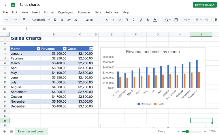
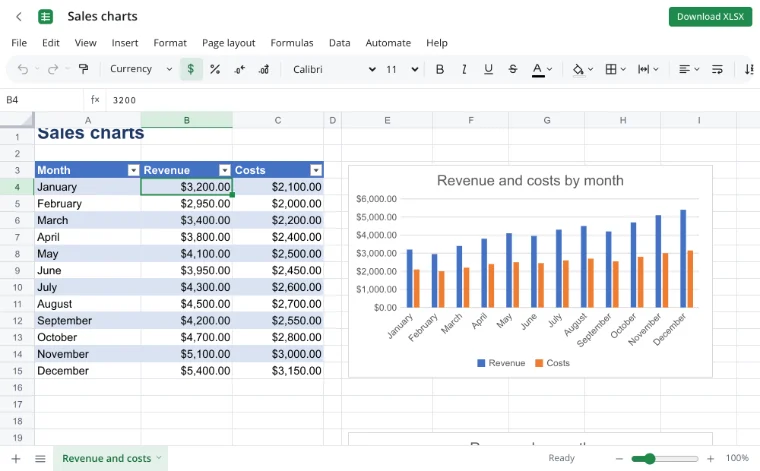
The example holds a year of revenue and costs, a column chart with both series and a line chart for revenue alone. That is the result you will build from your own rows.
Select the data
Select the range including the header row. The chart reads category labels and series names from the selection, so the headers must be filled in.
“Insert ▸ Chart”
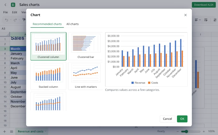
In the chart dialog, “Recommended charts” suggests options for the selection and shows each one in a live preview. The “All charts” tab offers all 21 types, from columns and lines to scatter and stock.
“Format chart”
The “Format chart” panel changes titles, the legend, axes, data labels and colors. It also turns on a trendline, error bars and a secondary axis, and the finished chart can be copied or downloaded as PNG or SVG.
How to make a graph online
Put the categories in one column and the numbers in the columns beside them, with a single header row. Select the range, open “Insert ▸ Chart” and start with “Recommended charts”: it shows a few options shaped for the selection, with a live preview. Choose one, or switch to “All charts” and pick a type and subtype yourself.
The chart appears on the sheet as an object. Move it, resize it or double-click it to edit. Nothing is installed, and the workbook stays in your browser until you save it to the cloud or download it.
Pick the chart for the question
| Question | Chart |
|---|---|
| How did values change over time? | Line or area. |
| How do categories compare? | Column or bar. |
| What share does each part hold? | Pie or doughnut. |
| How do two numbers relate? | Scatter. |
| Where does a total build up or drop? | Waterfall. |
| How is a set distributed? | Histogram or box and whisker. |
All 21 chart types
| Group | Types |
|---|---|
| Columns and lines | Column, bar, line, area, combo. |
| Parts of a whole | Pie, exploded pie, pie of pie, bar of pie, doughnut. |
| Points and distributions | Scatter, bubble, histogram, Pareto, box and whisker. |
| Flows and finance | Waterfall, funnel, stock, surface. |
| Hierarchies | Treemap and sunburst. |
| Comparison | Radar. |
Make a graph online with points
When the data is a set of x and y pairs, put x in one column and y in the next and choose a scatter chart. Markers show the points, and smooth or straight lines can connect them. A bubble chart adds a third number as the size of each point.
Charts follow the data
A chart stores a reference to its range, not a copy of the numbers. Edit a cell and the columns or the line redraw; add rows inside the range and they join the chart. If the range grows past its last row, extend the reference in the chart dialog so the new rows are included.
Pie and doughnut charts
A pie shows the parts of one total, such as spending by category for a month. Use a doughnut when the middle should stay free, and pie of pie or bar of pie when a few small slices need a second view. A pie only makes sense when the values add up to a meaningful whole.
For a summary that groups rows first, build a pivot table and chart its result. Labels, the legend and colors are set in the “Format chart” panel.
Graph maker online for math
Scatter and line charts plot numerical x and y values directly, which covers most classroom work: a function sampled at several points, a set of measurements or a comparison of two variables. A trendline fits the points, and error bars show how uncertain each value is.
Use cases
- Revenue and costs by month in one column chart.
- Expenses by category as a pie for a monthly review.
- Inventory levels by product and warehouse as a bar chart.
- Grades by subject or scores over a term.
- Plan versus actual side by side, with the gap visible at a glance.
Limits
- Real-time co-editing is not available: two people cannot edit one workbook at once.
- VBA macros do not run; an XLSM file is saved as XLSX.
- The older XLS format does not open, and workbooks with an open password are not supported.
- On the tool page a file is limited to 100 MB.
Privacy
The workbook opens and renders in your browser on your own device, so revenue, budgets and inventory stay with you. A file reaches a server only through “Save to cloud”, and cloud files are stored in the EU/US under GDPR. A finished report can be saved as a PDF.
Frequently asked questions
Support: [email protected]
How do I make a graph online?
Put the labels in one column and the numbers beside them, then select the range with its header row. Open “Insert ▸ Chart” and choose a recommended option or a type from “All charts”. The chart appears on the sheet, stays linked to the cells and can be formatted afterwards.
How do I make a line graph online?
Select a range where the first column holds dates or periods and the next holds values. Insert a chart and choose Line under “All charts”; several value columns become several lines. Open “Format chart” to change the title, legend and colors, and the line follows any edit in the cells.
How do I make a graph with x and y values online?
Place the x values in one column and the y values in the next, select both and insert a scatter chart. Markers show the pairs, and smooth or straight lines can join them. A bubble chart uses a third column for the size of each point, which suits a third measurement.
How do I make a bar graph online?
Select categories and their values, insert a chart and pick Bar or Column. Column charts run vertically and bar charts horizontally, which helps with long category names. Stacked and 100% stacked variants compare parts of a total, and the format panel sets labels and colors.
Can I make a graph in Word online?
A chart built here lives in a spreadsheet. To use it in a Word document, copy it or download it as PNG or SVG, then paste the image into the document. Zotu is not affiliated with Microsoft; in the document the chart is a picture, not a live spreadsheet object.
What can I use to make a graph online?
Use an editor that reads your data and keeps the chart linked to it. Open a table here, select the range and insert a chart; the bars or line update when a cell changes. A graph maker that only accepts typed numbers loses that link as soon as the data moves.
Is it free? Is there a watermark?
Yes, every chart type, the preview and the formatting panel are free, with no trial period and no watermark. You can open a workbook and build a chart without an account. Signing in is needed only for cloud storage, and the workbook can be downloaded at any time.
Is it safe to upload documents?
Nothing is uploaded: the workbook opens and renders in your browser on your own device, so revenue, budgets and inventory stay with you. A file reaches a server only through “Save to cloud”, and cloud files are stored in the EU/US under GDPR.
More tools
XLSX viewer
Open an XLSX workbook in the browser and save your edits back to the file.
CSV to Excel
Turn a CSV export into an XLSX workbook with real columns, numbers and dates.
Excel formulas
Write sums, averages, conditions and percentages with autocomplete and argument hints.
Pivot table
Build a report with regions in rows, products in columns, sums and grand totals.
Conditional formatting
Color cells by value, formula or date with rules, bars and icons.
Excel to PDF
Turn a spreadsheet into a print-ready PDF with its layout, charts and headers.
Household budget template
A free household budget spreadsheet: income and expenses by category, plan versus actual, variances and totals calculated for you.
VLOOKUP
Pull a price, rate or name from another table by code with a VLOOKUP formula.
Graph maker: turn a table into a chart in the browser
Build a chart from table data and format it on the sheet.
Open editor